# Iced - Additional Widgets
[](https://docs.rs/iced_aw)
[](https://crates.io/crates/iced)
[](https://github.com/iced-rs/iced/blob/master/LICENSE)
[](https://discord.gg/3xZJ65GAhd)
This crate contains additional widgets for the GUI library [Iced](https://github.com/hecrj/iced).
Every widget is hidden by a feature gate. This allows you to cherry pick the widgets you actually need.
## Usage
Include `iced_aw` as a dependency in your `Cargo.toml`:
```toml
[dependencies]
iced = "0.13.0"
iced_aw = { version = "0.11.0", default-features = false, features = [...] }
```
## Versioning
| `iced` version | `iced_aw` version |
| -------------- | ----------------- |
| 0.10 | 0.7 |
| 0.12 | 0.9 |
| 0.13 | 0.10, 0.11 |
## Widgets
### Badge
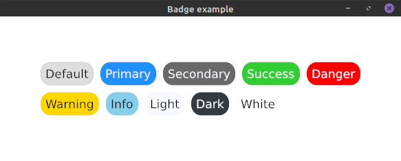
Please take a look into our examples on how to use badges.
Enable this widget with the feature `badge`.
### Card
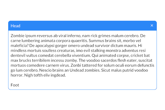
Please take a look into our examples on how to use cards.
Enable this widget with the feature `card`.
### Color Picker
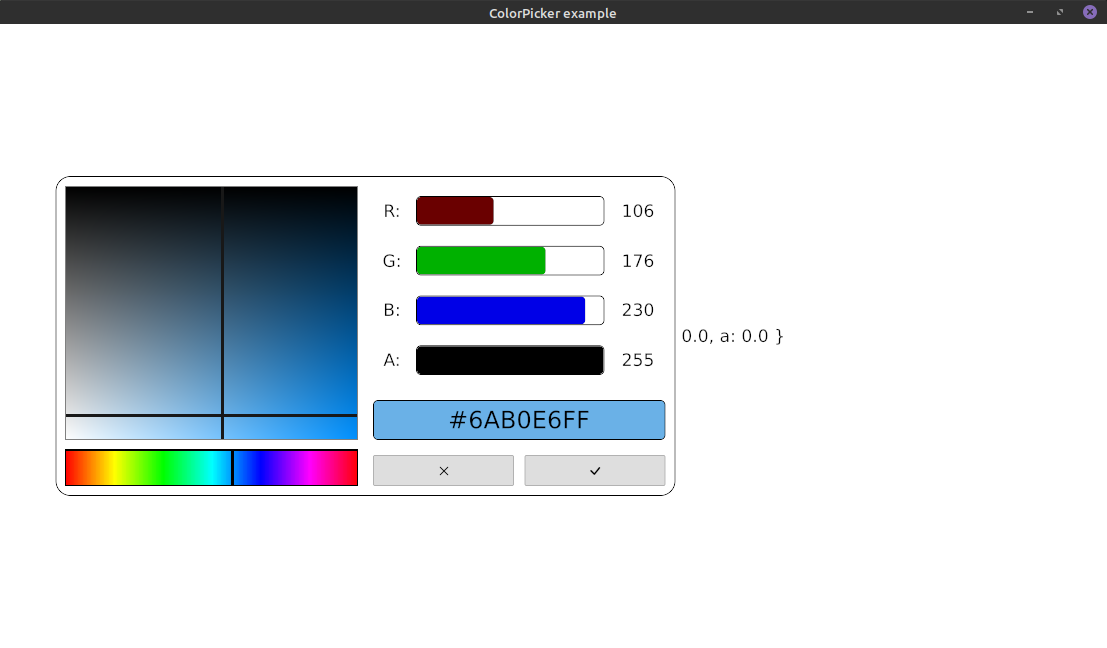
Please take a look into our examples on how to use color pickers.
Enable this widget with the feature `color_picker`.
### Date Picker
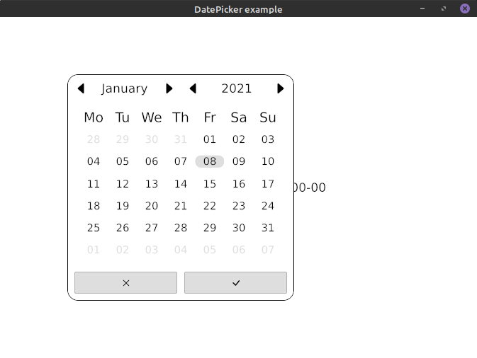
Please take a look into our examples on how to use date pickers.
Enable this widget with the feature `date_picker`.
### NumberInput
Just like TextInput, but only for numbers.
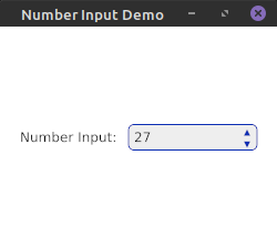
Please take a look into our examples on how to use number inputs.
Enable this widget with the feature `number_input`.
*This widget does currently not support web*
### SelectionList
A selection space to show any options passed in.
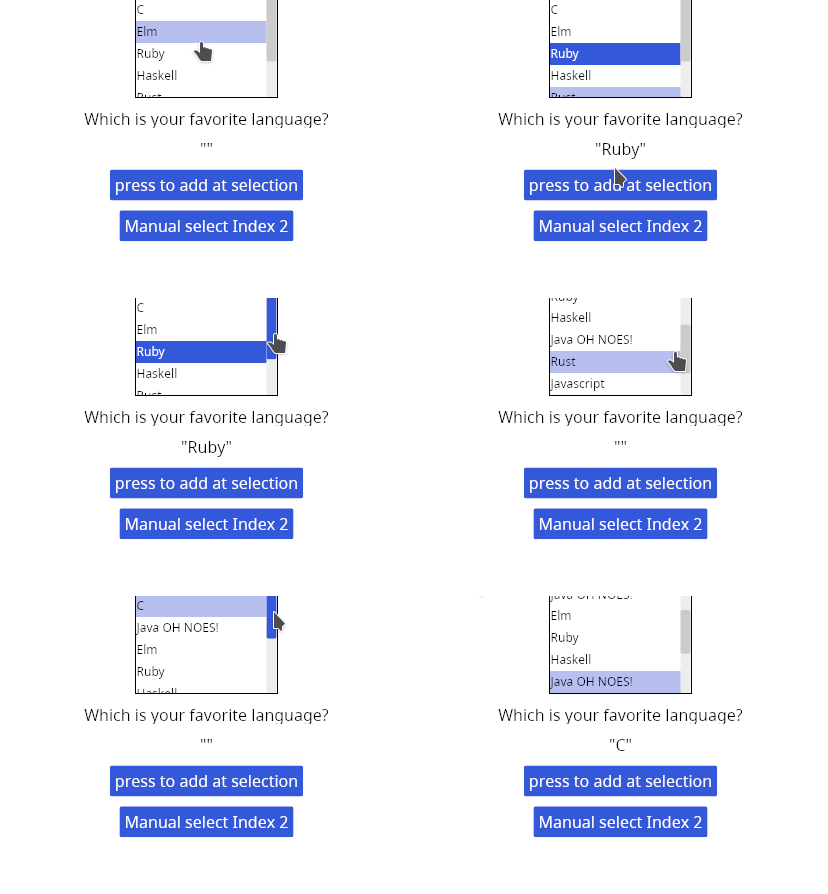
Enable this widget with the feature `selection_list`.
### TabBar and Tabs
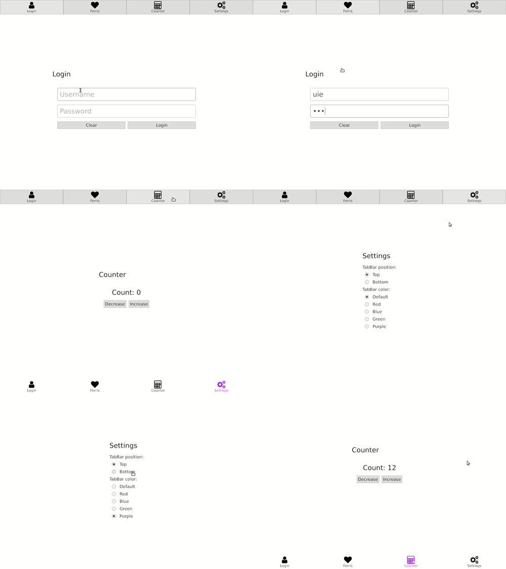
Please take a look into our examples on how to use TabBars and Tabs.
Enable TabBars with the feature `tab_bar` and Tabs with `tabs`.
### Time Picker
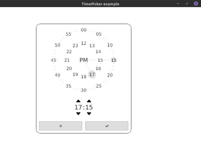
Please take a look into our examples on how to use time pickers.
Enable this widget with the feature `time_picker`.
### Menu
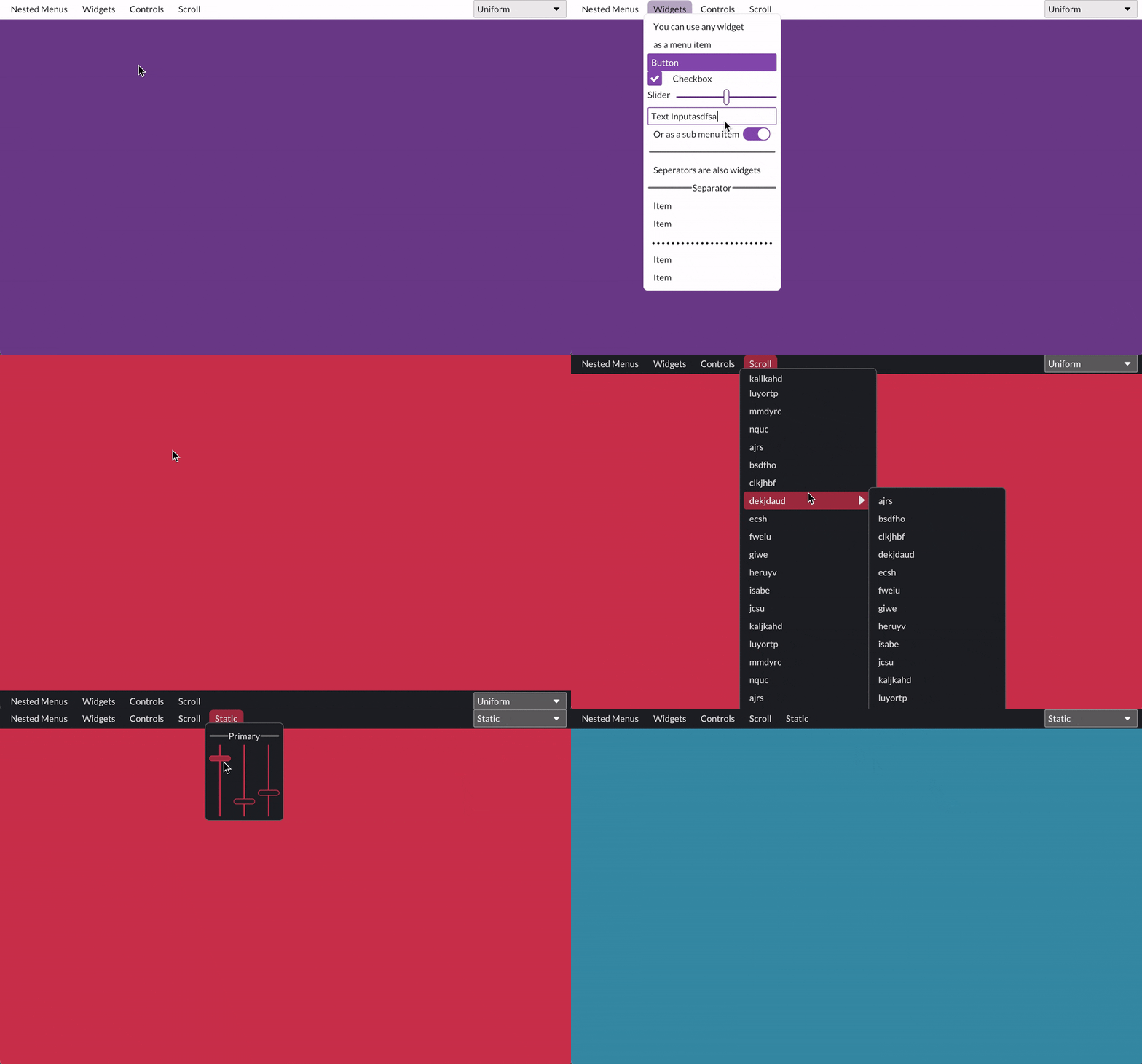
Please take a look into our examples on how to use menus.
Enable this widget with the feature `menu`.
You might also want to enable the feature `quad` for drawing separators.
### Slide Bar
Please take a look into our examples on how to use slidebars.
Enable this widget with the feature `slide_bar`.
### Context Menu
See the example [here](./examples/context_menu/src/main.rs)
### Drop Down Menu
See the example [here](./examples/drop_down/src/main.rs)
### Sidebar
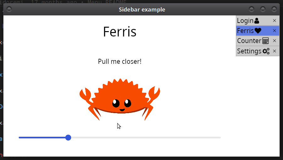
Please take a look into our examples on how to use Sidebar.
Enable Sidebar with the feature `sidebar`.
Also included in this feature, are two widgets `sidebar::column::FlushColumn` and `sidebar::row::FlushRow` that flushes the end/start element to the opposite direction to the alignment of the container.
### Color palette
This crate adds a predefined color palette based on the [CSS color palette](https://www.w3schools.com/cssref/css_colors.asp).