bevy_material_ui
| Crates.io | bevy_material_ui |
| lib.rs | bevy_material_ui |
| version | 0.2.7 |
| created_at | 2025-12-23 21:38:28.647215+00 |
| updated_at | 2026-01-25 22:04:35.77121+00 |
| description | Material Design 3 UI components for Bevy game engine |
| homepage | |
| repository | https://github.com/edgarhsanchez/bevy_material_ui |
| max_upload_size | |
| id | 2002357 |
| size | 13,623,309 |
 Edgar H Sanchez (edgarhsanchez)
documentation
https://docs.rs/bevy_material_ui
README
bevy_material_ui


A Material Design 3 UI library for Bevy.
Live WebGL Showcase
Installation
[dependencies]
bevy_material_ui = "0.1"
Documentation
- Documentation index: docs/README.md
- Developer guide: docs/DEVELOPER_GUIDE.md
- Component docs: docs/components/
- Run the interactive showcase:
cargo run --example showcase - Run the WebGL showcase locally (WASM): see below
WebGL (WASM) Demo
Build and run the WebGL showcase locally:
- Install the wasm target and wasm-bindgen CLI.
- Build the minimal showcase for WebGL.
- Serve the
web/output.
Example commands:
rustup target add wasm32-unknown-unknowncargo install wasm-bindgen-cli --version 0.2.106cargo build --release --no-default-features --features bevy_minimal,webgl --target wasm32-unknown-unknown --example showcase_minimalwasm-bindgen --out-dir web --target web target/wasm32-unknown-unknown/release/examples/showcase_minimal.wasm- Serve the
web/folder (any static server)
Features
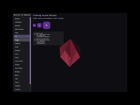
- Material Design 3 Components: Buttons, FABs, Cards, Checkboxes, Switches, Radio Buttons, Sliders, Text Fields, Dialogs, Lists, Menus, Tabs, Progress Indicators, and more
- Date/Time Picker: Material-style date and time picker component (see the showcase for an end-to-end example)
- Icons: Material icons embedded at build time and rendered via Bevy UI
ImageNodetinting - Theming: Dynamic color system with light/dark mode support
- Animations: Motion system following MD3 guidelines
- Accessibility: Proper touch targets and focus handling
- Web Showcase: WebGL/WASM demo hosted on GitHub Pages
Icons
By default, this crate uses the published google-material-design-icons-bin crate as its icon source.
Icons are embedded as ALPHA8 and expanded to RGBA8 (white + alpha) at runtime so Bevy UI tinting via ImageNode.color continues to work.
Using Icons
use bevy::prelude::*;
use bevy_material_ui::icons::{MaterialIcon, ICON_HOME};

fn spawn_icon(mut commands: Commands) {
    // Spawn a home icon (tinted white)
    if let Some(icon) = MaterialIcon::from_name(ICON_HOME) {
        commands.spawn(icon.with_size(24.0).with_color(Color::WHITE));
    }
}
Available Icons
Common icon name constants are available in bevy_material_ui::icons, for example:
- Navigation:
ICON_HOME,ICON_MENU,ICON_ARROW_BACK,ICON_CLOSE - Actions:
ICON_ADD,ICON_DELETE,ICON_EDIT,ICON_SEARCH,ICON_SETTINGS
You can also use arbitrary icon names (folder names from the upstream repo):
use bevy_material_ui::icons::MaterialIcon;

let icon = MaterialIcon::from_name("arrow_drop_down");
License
This library is licensed under MIT.
Releases (semantic versioning)
Publishing to crates.io is automated via GitHub Actions and uses tags of the form vMAJOR.MINOR.PATCH.
- Update
versioninCargo.toml. - Commit and push to
main. - Create and push a tag like
v0.1.1.
The workflow in .github/workflows/publish.yml verifies the tag matches Cargo.toml and then runs cargo publish.