leptos_ui
| Crates.io | leptos_ui |
| lib.rs | leptos_ui |
| version | 0.3.19 |
| created_at | 2025-03-03 15:46:31.559677+00 |
| updated_at | 2026-01-15 22:45:27.873479+00 |
| description | Macros to build UI components easily with Leptos and Tailwind CSS. |
| homepage | https://rust-ui.com |
| repository | |
| max_upload_size | |
| id | 1575777 |
| size | 80,017 |
 Max Wells (max-wells)
documentation
README
Leptos UI
Macros to build UI components easily with Leptos and Tailwind CSS. Built on top of tw_merge.
Features
clx!: Creates components with childrenvoid!: Creates self-closing components (<img />,<input />, etc.)
Both support automatic data-name attributes and Tailwind CSS class merging, without class conflicts.
Example in Production
This crate is used in rust-ui.com — check it out to see Leptos UI and Tailwind CSS in action :)
Usage
Basic Component with clx!
// components/ui/card.rs
use leptos::prelude::*;
use leptos_ui::clx;

mod components {
    use super::*;
    clx! {Card, div, "rounded-lg p-4", "bg-sky-500"} // 🩵
}

pub use components::*;

// components/demos/demo_card.rs
#[component]
pub fn DemoCard() -> impl IntoView {
    view! {
        <Card>"Card bg-sky-500 🩵"</Card>
        <Card class="bg-orange-500">"Card bg-orange-500 🧡"</Card>
        // └──> 🤯 NO CONFLICT CLASS!!
    }
}
Basic component with void!
use leptos::prelude::*;
use leptos_ui::void;

// Define self-closing components
void! {MyImage, img, "rounded-lg border"}
void! {MyInput, input, "px-3 py-2 border rounded"}
void! {MyDiv, div, "w-full h-4 bg-gray-200"}

#[component]
pub fn Demo() -> impl IntoView {
    view! {
        // ...
        <MyImage attr:src="test.jpg" class="w-32" />
        <Input prop:value=move || url().to_string() attr:readonly=true class="flex-1" />
        <MyDiv class="bg-blue-500" />
    }
}
VSCode Tailwind CSS IntelliSense
Enable autocomplete and conflict detection for Tailwind classes inside clx! and void! macros:
-
Install the "Tailwind CSS IntelliSense" Visual Studio Code extension
-
Add the following to your
settings.json:
{
  "tailwindCSS.includeLanguages": {
    "rust": "html"
  },
  "tailwindCSS.experimental.classRegex": [
    ["clx!\\s*\\{[^,]*,\\s*[^,]*,\\s*\"([^\"]*)\""],
    ["void!\\s*\\{[^,]*,\\s*[^,]*,\\s*\"([^\"]*)\""],
    ["tw_merge!\\(([^)]*)\\)"]
  ]
}
This enables:
- Tailwind class autocomplete in Rust files
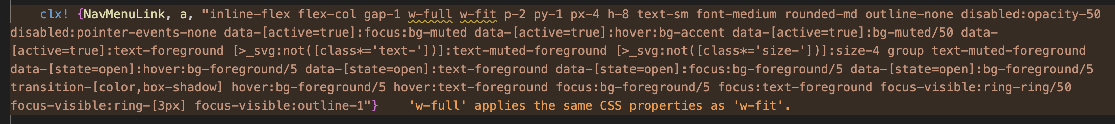
- Real-time conflict detection (e.g.,
w-full w-fit) - Hover documentation for Tailwind classes
Changelog
September 2025 - leptos_ui v0.2 Breaking Changes
We refactored the leptos_ui crate with breaking changes.
New macro system:
clx!: Elements with childrenvoid!: Self-closing elements (no children)
See MDN Docs for reference about void elements.
Attribute changes: Removed direct props from macros. Use attr:* and prop:* pattern instead:
// Define component
void! {MyInput, input, "border border-input"}

// Before
<MyInput value=move || url().to_string() readonly=true class="flex-1" />

// After
<MyInput prop:value=move || url().to_string() attr:readonly=true class="flex-1" />
License
This project is licensed under the MIT License. See the LICENSE file for details.